These three are the formats we get asked to compare most often. None of them is universally "better" — each solves a slightly different problem.
Acrylic wall signage
Best for: reception walls and suite entrances where you want a clean, professional look without illumination.
Look: a flat or standoff-mounted panel, available clear, frosted or in colour.
Consider if: you want the simplest, most cost-predictable option that still looks deliberate rather than temporary. See acrylic wall signage.
Backlit 3D signage
Best for: the single most visible wall in the office, usually the main reception.
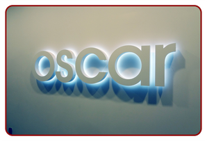
Look: raised letters or a logo with light glowing from behind, creating a halo effect.
Consider if: the reception is the main brand moment for clients and you want it to stand out, including in low light. See backlit 3D signage.
Cut-out letter signboards
Best for: meeting rooms, department names, and secondary logo walls.
Look: individual letters mounted straight to the wall with no backing panel, more minimal than a full sign.
Consider if: you need several smaller signs around the office rather than one statement piece, or you expect to relabel a room later. See cut-out letter signboards.
A quick way to decide
If you are only signing one wall and it is the first thing clients see, backlit or acrylic will do more for your brand. If you are signing multiple smaller spaces — meeting rooms, offices, departments — cut-out letters are usually the more practical and economical spread. Many offices use both: backlit or acrylic at reception, cut-out letters everywhere else.
See the full picture on our indoor office signage page, or read our room-by-room signage guide for where wayfinding signage fits in as well.